The Challenge
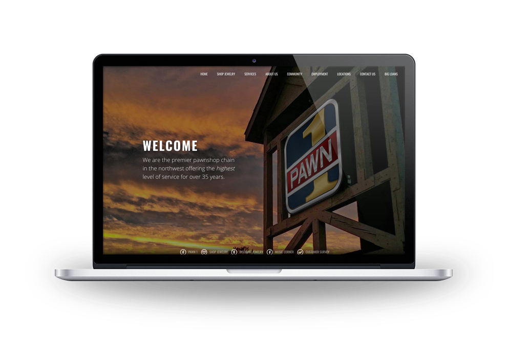
Pawn 1 wanted to create a site that felt personable and consumer-friendly, but also inspired trust and conveyed their legitimacy as a financial institution.
Our Solution
In terms of visual design, our highly visual, mobile-first approach marked a pretty big departure from traditional financial websites. While many financial institutions succeed at instilling trust, they often miss the boat on creating a comfortable, personable first impression. Our goal was to effectively balance both in order to fulfill Pawn 1's goal of creating a site that feels both reliable and approachable.
In order to inspire trust and challenge commonly-held preconceived negative notions of what a pawn shop is supposed to be, we created an online virtual tour. Our tour worked to set Pawn 1 apart and reset customer expectations by focusing on their well-lit, organized, and clean stores.
Retail is a big part of Pawn 1, and several of their locations feature a "store within a store” concept. Many of the Pawn 1 locations have a Music Corner, Dottie’s Discount Jewelry store, and some have both. Offering a selection of new and used music gear, the Music Corners stores in Pawn 1 locations are often the largest music shops in their community. Dottie’s provides curated collection of new and pre-owned Jewelry, and is a great alternative to traditional Jewelry retailers. It was important for us to highlight the different social media efforts of each brand.


